A new look and name for Canada’s largest national provider of non-profit group health insurance for education retirees.
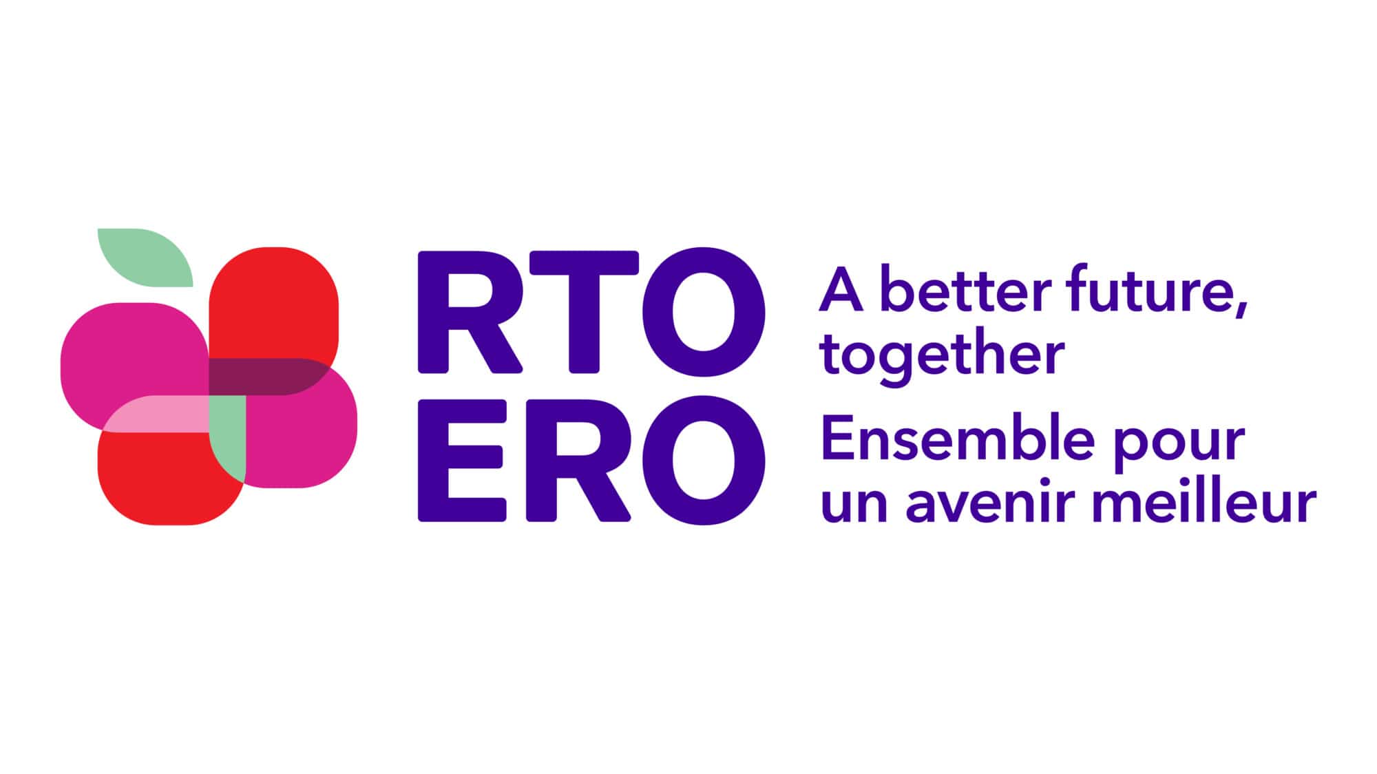
RTOERO is made up of 80,000 members across Canada. They are influential advocates and the largest national provider of non-profit group health insurance for education retirees. Through a deep strategic engagement we helped create the RTOERO rebrand.
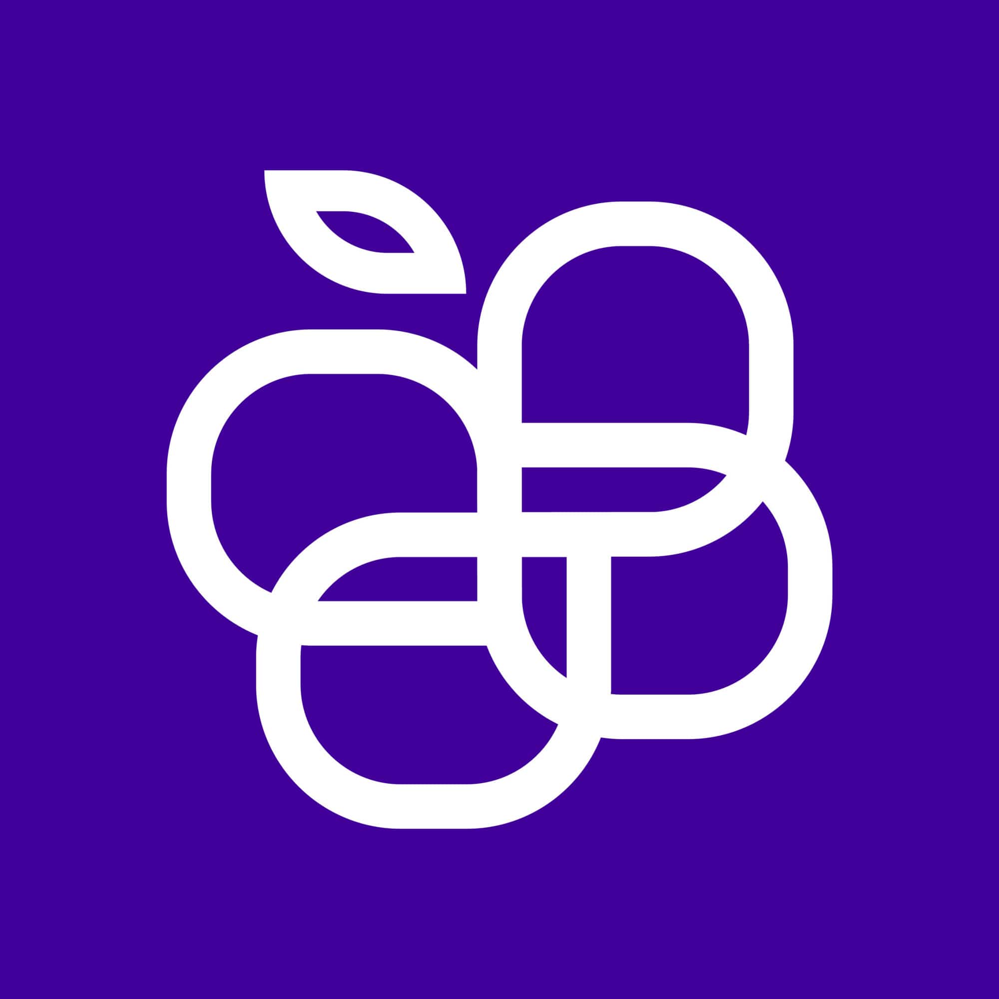


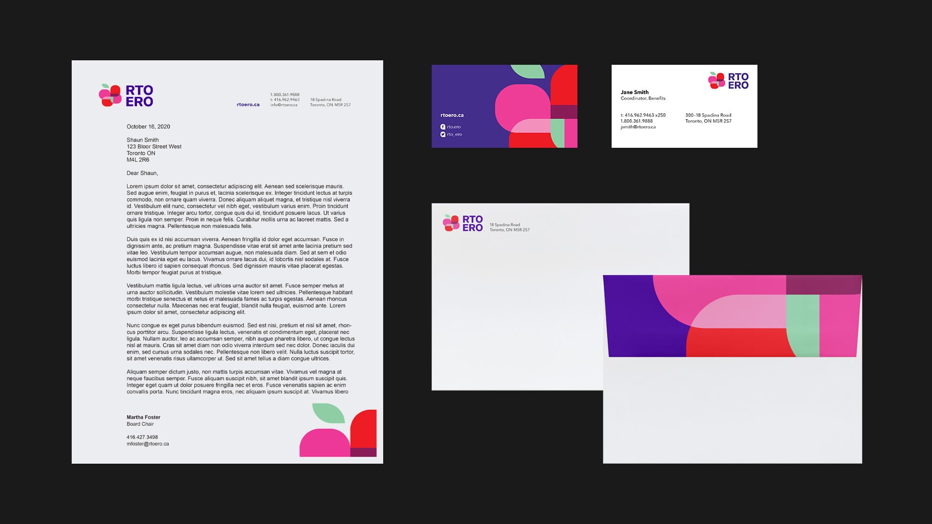
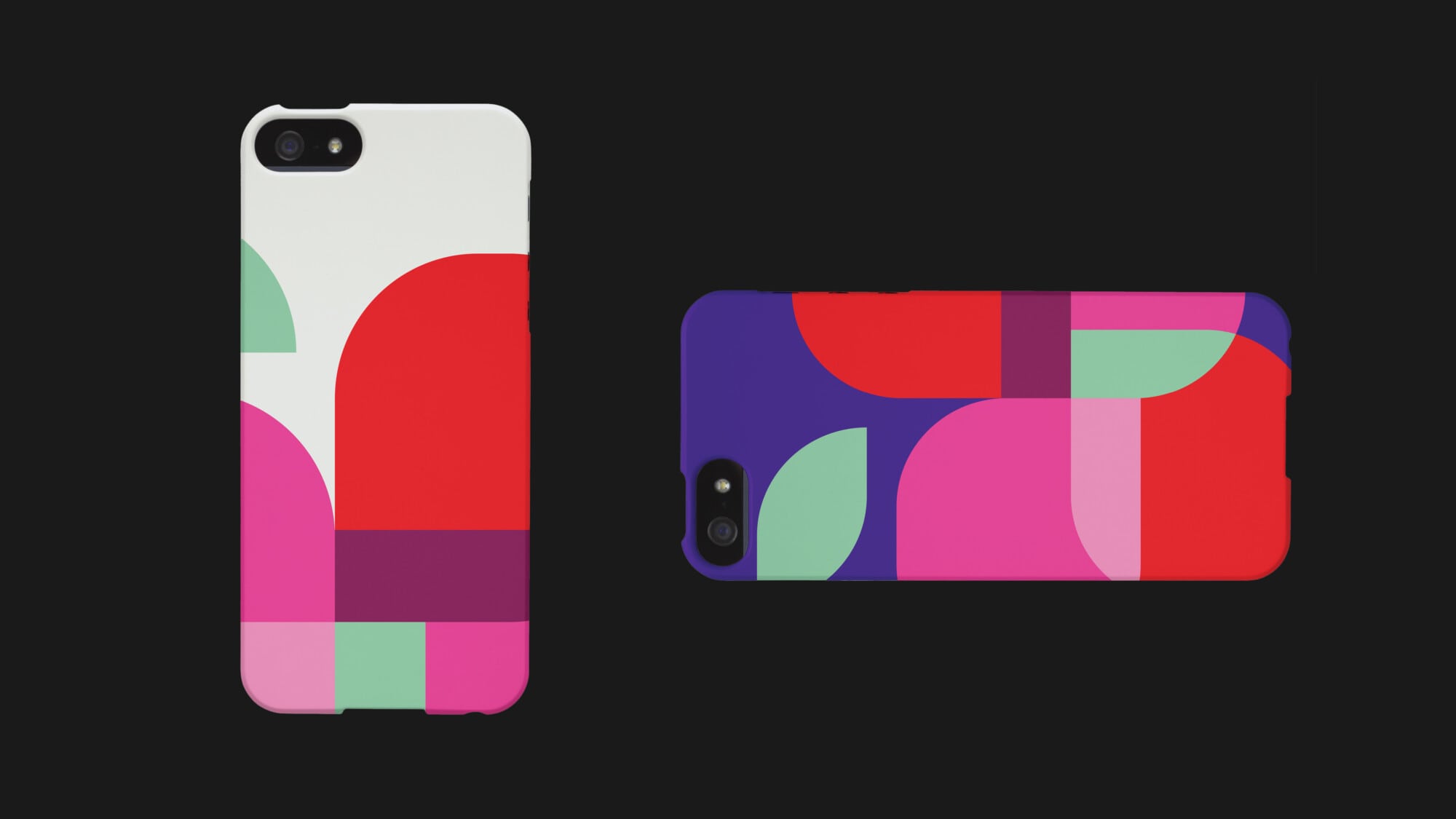
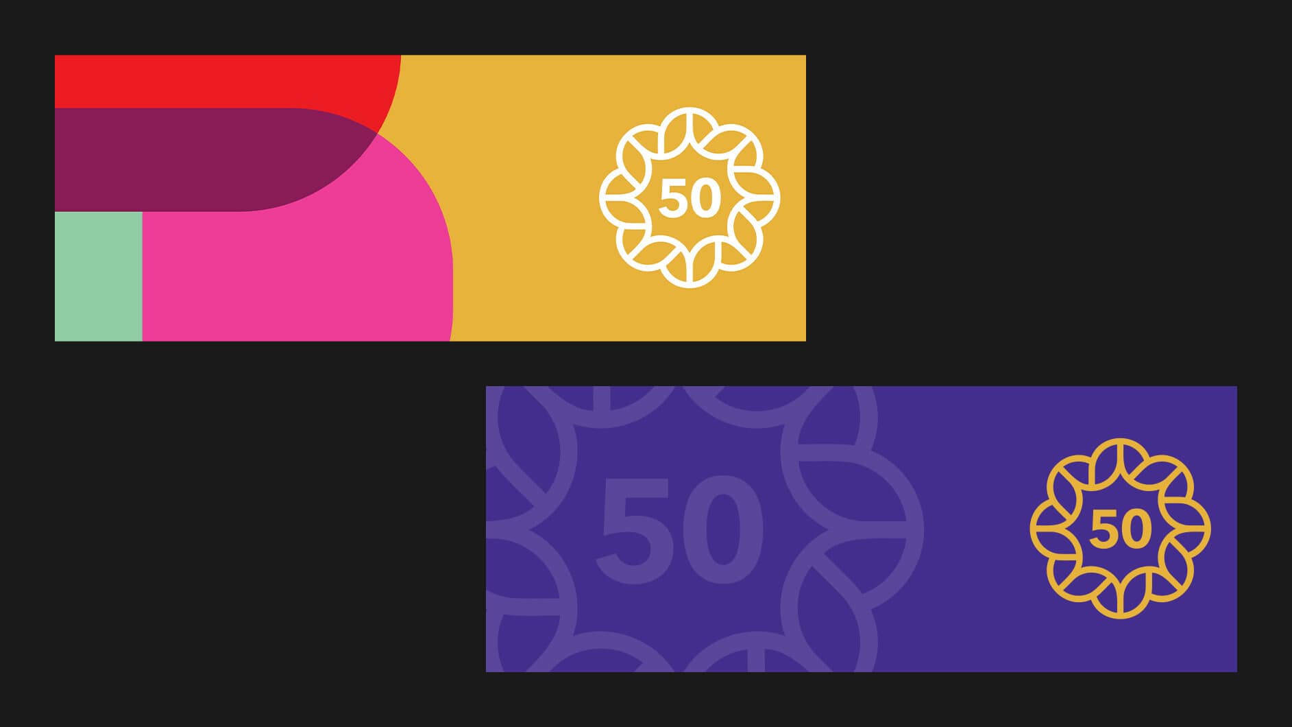
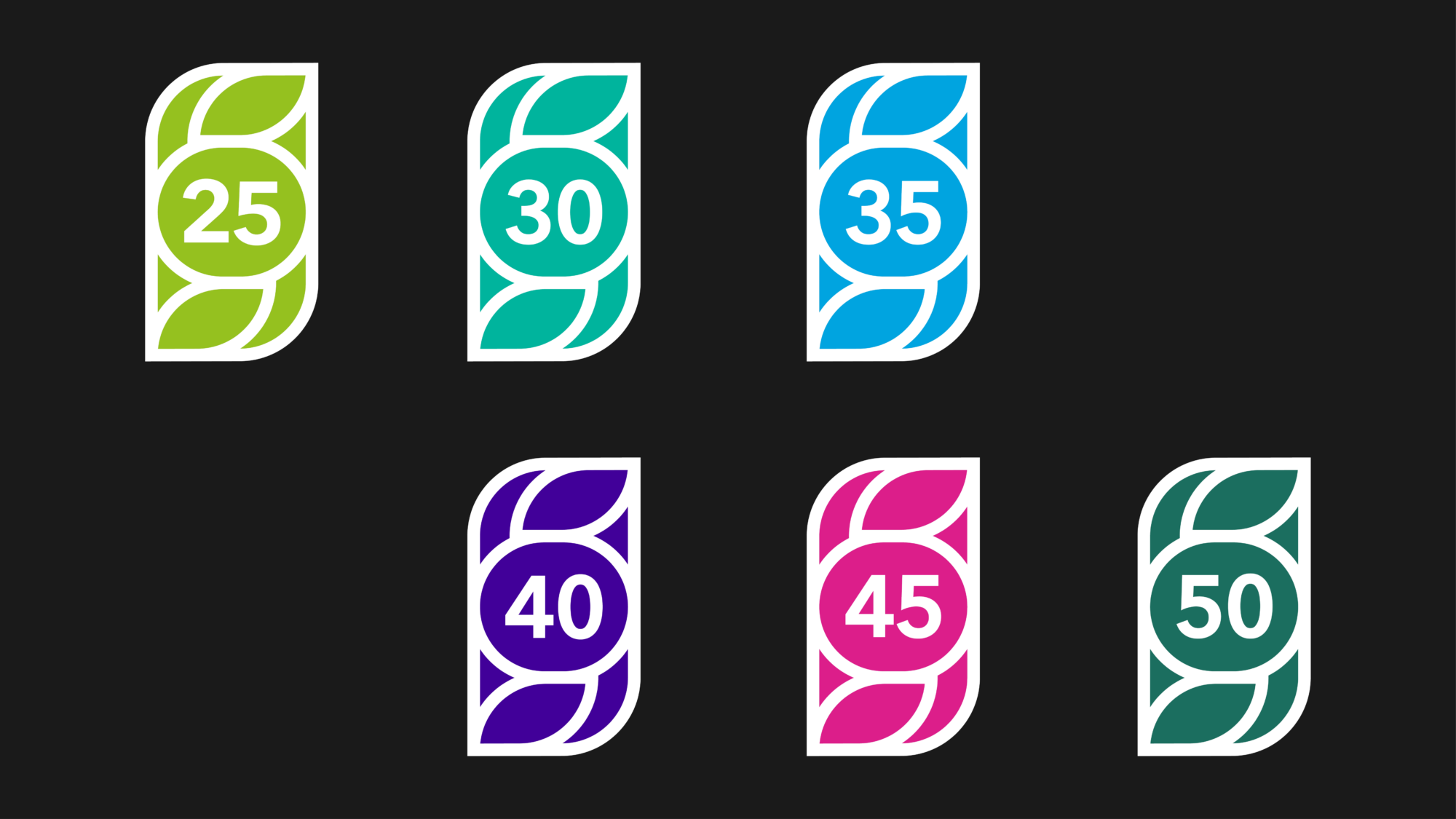
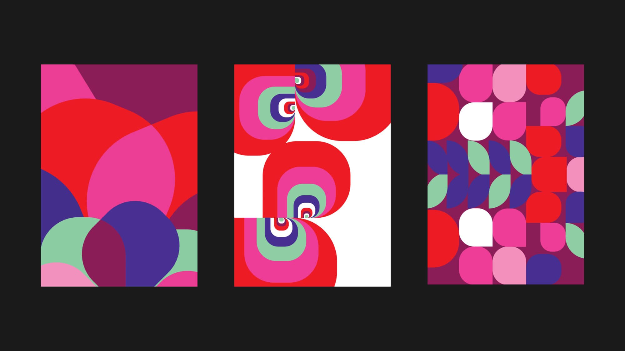
The apple symbol tips its hat to the education sector and suggests renewal and growth. The unified mark is made up of overlapping shapes depicting connections and transparency. The mark is supported by a very comprehensive brand system and guidelines.