Over 60 years of creating beautiful smiles in the community.
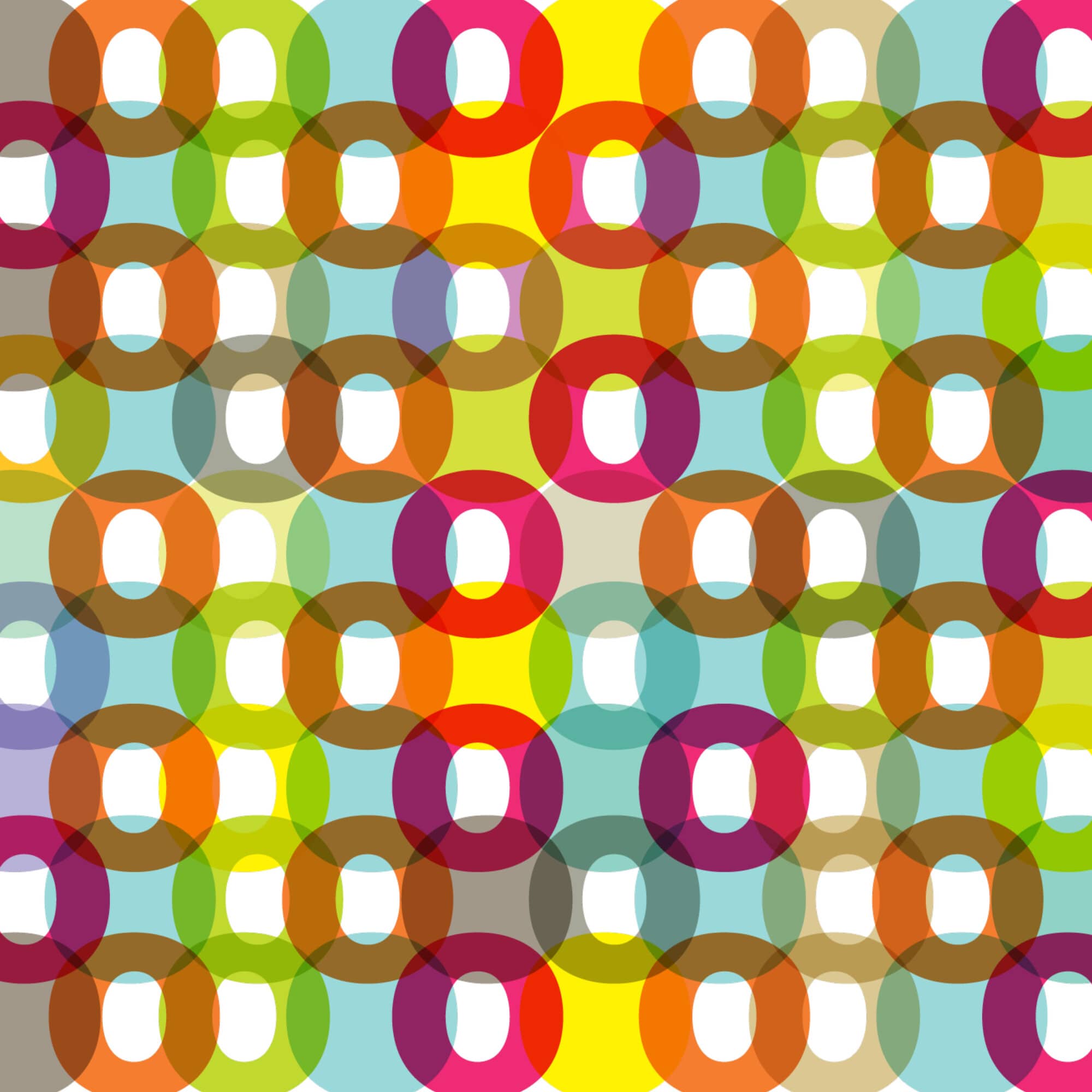
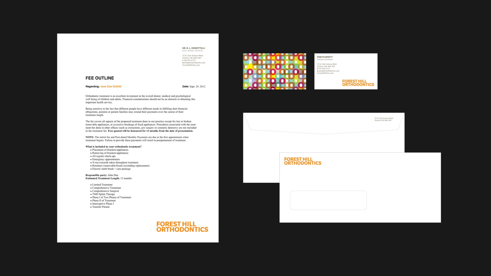
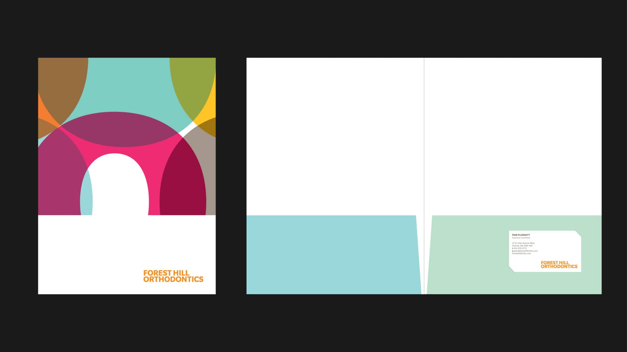
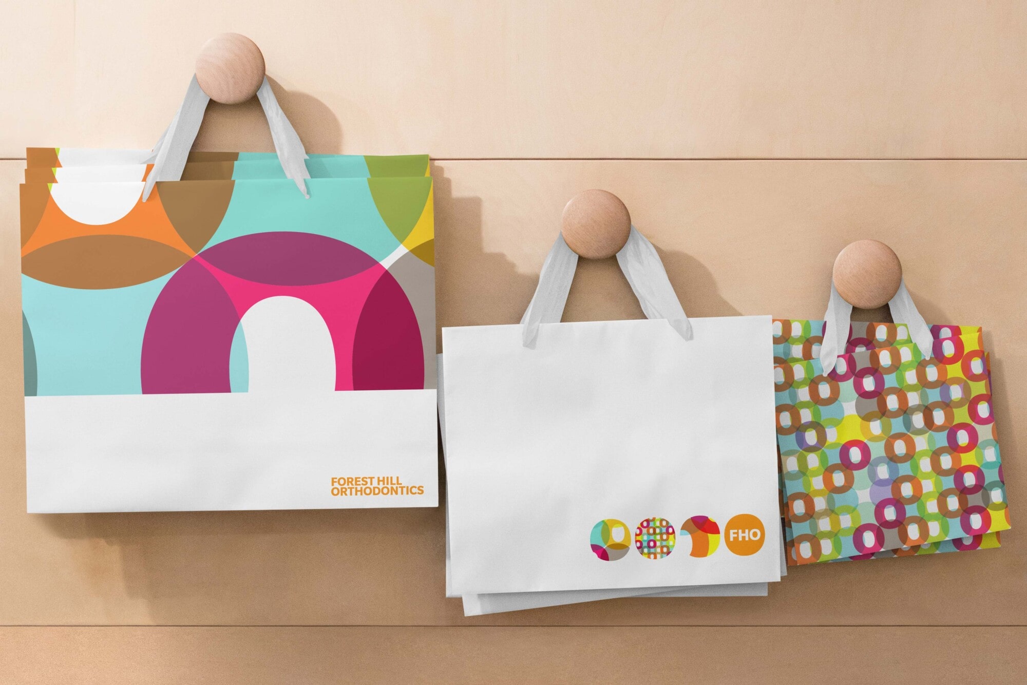
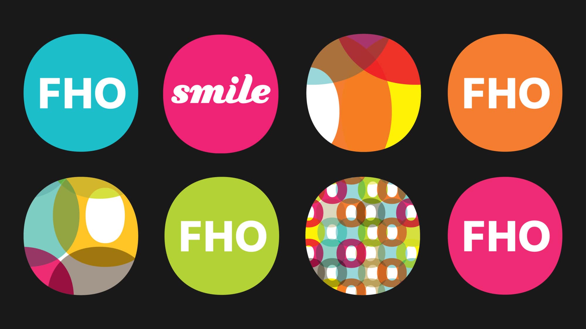
Forest Hill Orthodontics (FHO) approached us to assist them with the rebranding of their highly successful practice. Over the years FHO has gone to great lengths to create a pleasurable experience for their clients – excellent communications, a colourful and comfortable environment and a friendly staff. We felt strongly that the brand expression needed to exhibit the very same characteristics. Like healthy smiles, a multi-coloured mosaic of overlapping letter “O”s allows the white counters (the middles of the letterform) to shine through.