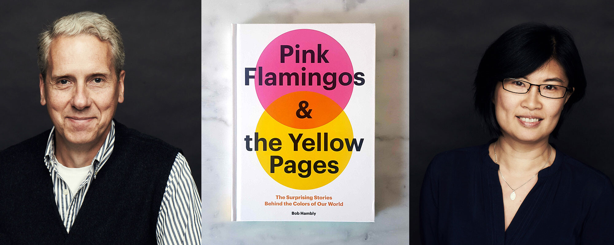
Pink Flamingos & the Yellow Pages

One remark that Hambly & Woolley receives constantly is that our work really celebrates colour. It really is a calling card for sure. It has been part of our DNA for over 30 years, and for good reason. Founding partner Bob Hambly LOVES colour. Some might say it is obsessional. Early on in his life, Bob started to study colour. It began with his love of drawing, but Bob’s adoration of colour flourished throughout his career and turned into a deep knowledge. It was absolutely no surprise then that this wealth of insight has been turned into a book. Out now from Chronicle Books, Pink Flamingos & the Yellow Pages tells the surprising stories behind the colours of the world. We thought it would be fun for our other colour-mad team member, Design Director Frances Chen, to sit down with Bob and dig into some of his own story of where this love came from.
FC: You mentioned that your mom knowingly and unknowingly taught you invaluable lessons on colour. Can you elaborate on that?
BH: My mom had a terrific colour sense. She liked to wear rich earth tones with subtle accent colours like salmon pinks and rusts, always putting amazing colour combinations together. I fondly recall her collection of art glass with its blends of burgundy, amber and phthalo green. The dancing reflections these pieces cast on our white walls mesmerized me. Indirectly, she taught me about colour’s complexities and nuances.
FC: “Colour Studies” was a blog you started a few years ago and still going strong today. What inspired you to do this?
BH: When I knew it was time to graduate from Hambly & Woolley, it was important that I have several projects ready to step into. Colour was something I had a strong desire to continue exploring. The blog format has allowed me the flexibility to post everything from word origins to photos to essays. Now I’m enjoying having the time to dive into a subject and investigate it thoroughly.
FC: This blog has now transpired into your first book…what an incredible journey. Did you ever imagine that this would happen? Tell me what that day was like when you received that email from Chronicle Books.
BH: Someone once told me, “Everyone has at least one book inside of them.” Nice thought, but for me, that seemed a million miles away. One day, while in the H&W boardroom, I received an email from the art and design book editor at Chronicle Books saying that she had seen my blog and thought it would make a good book. I’ll never forget that moment. I went from dumbfounded to thrilled to scared in about three seconds.
FC: With all that colour history behind you, which is your favourite story and why?
BH: Boy, I have so many favourites. I’ve always liked the story about the origin of barber poles. It encompasses so many areas – history, culture, symbols, advertising. Not to mention, it’s a bit weird.
FC: I’m curious to know about the process in finding what story you want to write about.
BH: I hunt for stories everywhere – reading, watching movies, following the news, conversations, walking. These days my colour radar is on high alert. I’m forever asking, “Why is that thing that colour?” Mostly, I’m interested in the unexpected and the surprising. For instance, who knew that they once made oil paint from mummies?
FC: How did the title “Pink Flamingos & The Yellow Pages” come about?
BH: The editors at Chronicle Books came up with the name. I immediately liked it. I ran it by my wife, Barb, and daughter, Emma, who had helped me with the book. They also thought it was great.
FC: Do you have a favourite colour?
BH: I’m constantly finding new colours that delight me. My latest discovery is often my new favourite. Recently, I made a study of winter colours found in nature. For weeks, I was captivated by the hue of a poison ivy plant’s frozen berries – an acidic shade of buttery yellow. It’s a nice colour, especially when next to snow. Crazy when you consider this is a plant that has caused me much pain throughout my life. This week the colour is fuchsia, inspired by the gerbera flower sitting on my desk. It’s a happy colour.
FC: Do you believe in such a thing as the “ugliest” and the most “beautiful” colour? Why?
BH: I firmly believe that beauty is in the eye of the beholder. Personally, I’m a fan of “dirty” colours – like taupes and Payne’s grey. Many people would run from those colours. How we evaluate colour depends a lot on its applications. A Kelly green handbag – nice! A Kelly green car – not so much.
FC: I know you split your time between writing, photography and doing art these days. Your collage assemblages are gorgeous…every piece meticulously placed and perfectly balanced. And your photography, equally stunning. Do you see a similarity (colour-wise) between the way you do collages and the way you find “that” particular crop for a photo? Do you use the same pair of “eyes”?
BH: One of the things I like most about photography is coming across unusual colour combinations. I can’t control the colours my camera sees, whereas in a collage or assemblage, I can. In each case, many decisions are being made – some consciously, some intuitively. So yes, it’s the same “eyes,” just a different focus.