Enduring Brands
“How long will this logo last?” isn’t an easy question to answer. But clients love to ask it. Even the very best fortune-teller would say it’s hard to know.
If a logo lasts more than 10 years these days, it is an eternity. Many logos disappear not long after they are implemented. Even Uber has rebranded. Logos change for a variety of reasons: the company is sold, a new CEO or marketing director wants to put their own stamp on it, the company changes strategy, or sadly, the business fails.
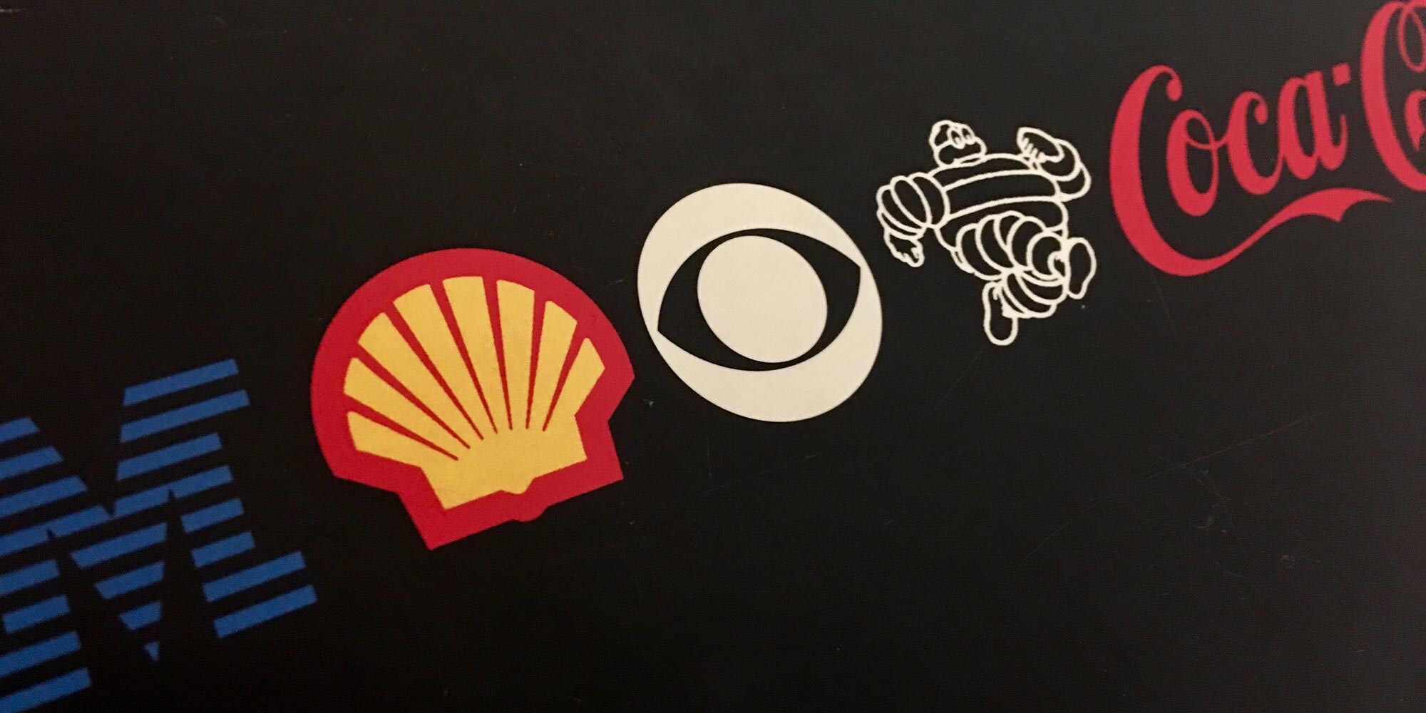
Look at John Deere, Coca-Cola, Shell, Levis, and Bass Ale though. With minor tweaking, these logos are all essentially the same, one hundred years after their launch. IBM, by comparison, is merely 50 years old. Remarkable and perhaps, lucky.
To build an enduring visual identity, you need to understand the visual identity you are building. What is expected of it? Is it for a start-up, a new retail enterprise, a product or a consulting firm? Are you refreshing an existing logo or starting from scratch? Does a previous brand or perhaps, beloved logo exist? What are the constraints given to you by the client? What does the logo need to evoke? In addition to good brand strategy, you need to figure out where on the spectrum the logo is to live: short-term, of-the-moment, or like Prudential, rock-solid.
We worked on the Peel District School Board visual identity 15 years ago. In this case, there wasn’t much to go on, save for this: Times New Roman Italic Bold Caps set in a solid navy blue bar from a MS Word template.
Seeing that, we thought we had carte blanche. 18 months of wonderful work went into the strategy, but when it came right down to it, the client asked us to retain the “P” – for Peel. Evidently, there was still a great amount of affection for a lapel pin set in the 70s typeface Pump.
We’ve always said that constraints are good. They narrow your focus. I read that when Michael Beirut was given all the latitude in the world to redesign Saks Fifth Avenue’s identity, it took two years of playing around, before he decided to stick with the Tom Carnase-designed version from the 70s. Though Beirut’s studio enlarged it, cut it up and moved it around to create newness.
What we have observed is that a logo has to be simple, and graphic, and pared down to its most minimal. This makes them the most memorable too.
So, when it came to Peel, we endured. We found a nostalgic typeface – aptly named New Century Schoolbook – used the P, and created a smiling face that we think will always symbolize a welcoming place to come and learn.
But we know, if a logo lasts, there is always a bit of luck involved.