Back to school
How curiosity-based research is imperative in the development of thoughtful graphic design.
Back to school is always an interesting reset for me. I had this conversation in the office a few times around September, feeling like it is a restart. Obviously with COVID everything is a little bit stranger, but one of my joys right now is to walk with my son to school.
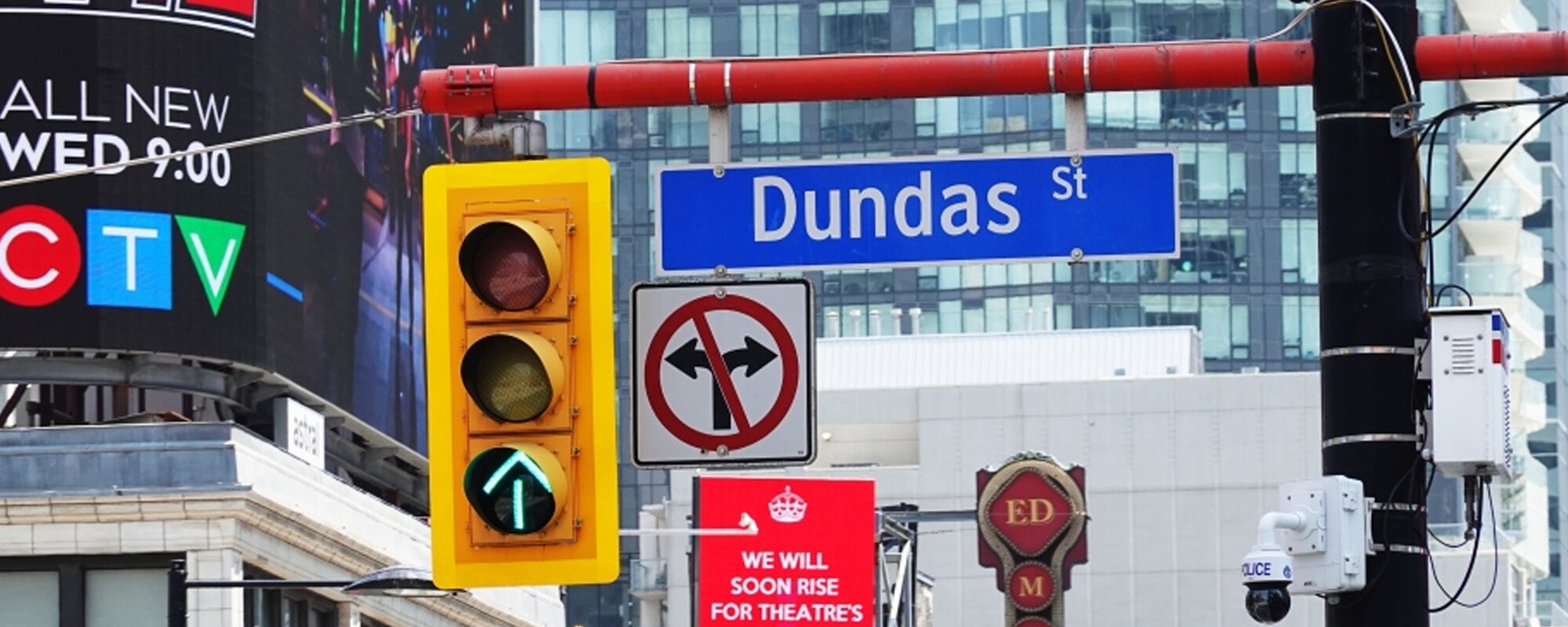
We have a game that we play where we look for the alphabet in the signage along the streets of Toronto.
He is nine years old and we have played this game time and time again, but he never gets bored of it. Neither do I. Starting with A, we find a word that begins with each letter of the alphabet, preferably the first word on the sign, and then continue through to Z.
This is something that graphic designers do all the time. We may not be looking for particular patterns but we’re constantly looking. For the majority of us, our ideation and thinking is led by the world that surrounds us. That can be flat visuals, environmental, cinema, literature, performing arts, music and pretty much anything else that inspires us to think. This is where we become curious. This is where graphic designers play in the sandbox best. Curiosity-based research is something that we do inherently and leads to some of the best project outcomes.
Curiosity-based research is a term that is being used a lot in science right now. It is super exciting. As I say, it is something that graphic designers have been using since the start of our profession, really. The best work is led sometimes by the most obscure, or abstract, tangent that takes us down rabbit holes that result in us creating intelligent, thoughtful and, hopefully, surprising solutions.
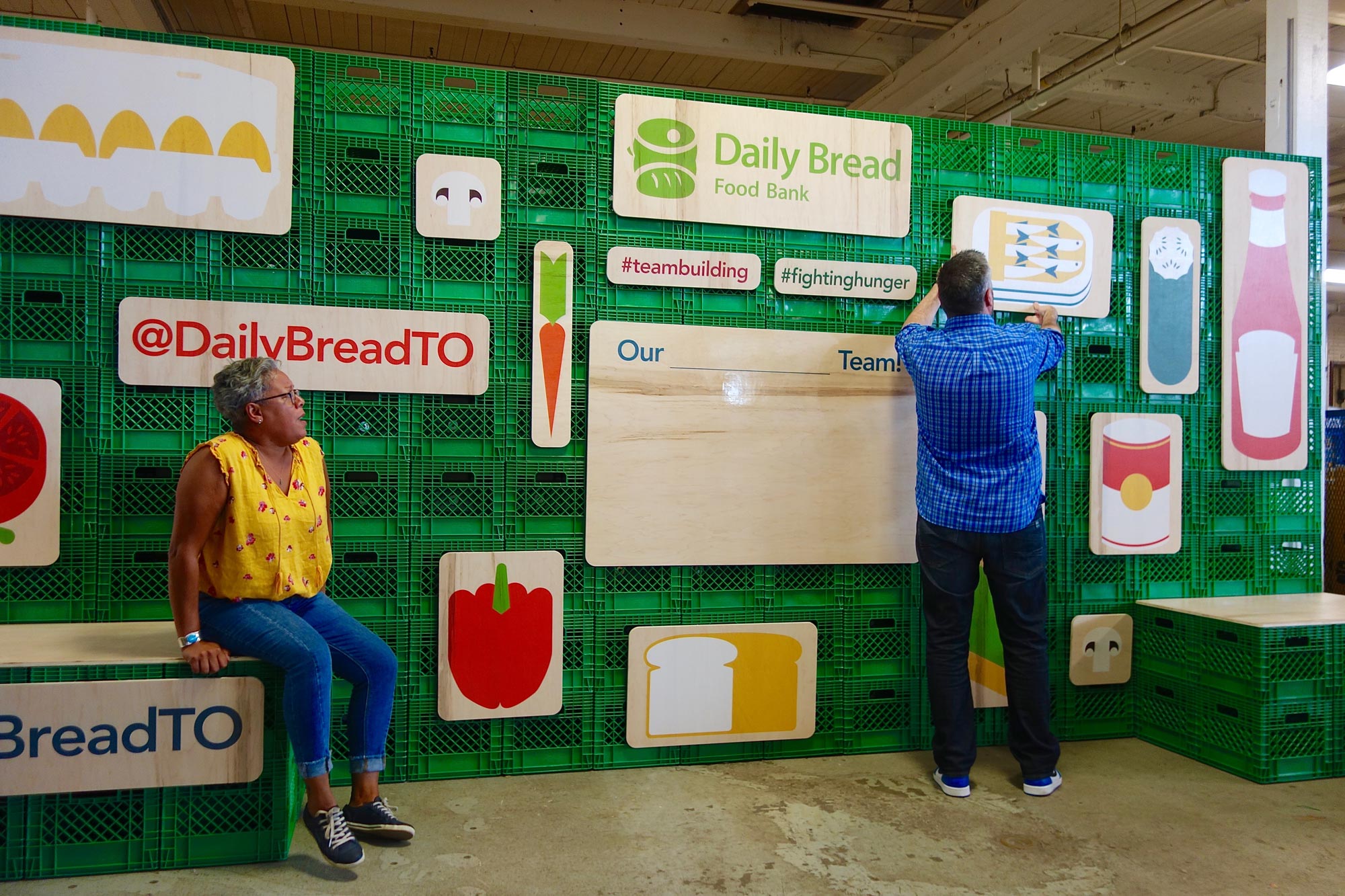
We used this kind of research last year when we worked at the Daily Bread Food Bank (DBFB). We were asked to create a social media zone in their warehouse that volunteers could use as a backdrop to take their team selfies. We spent time in the warehouse and really absorbed the space. We took photos of everything from packaging that food arrives in, to the signage they were using, to architectural details and to the colours that the warehouse was painted. We took all of that back and absorbed it.
Almost as a moment of collective consciousness, Bob, Taylor and myself found visual examples of people using milk crates to build structures everywhere. There were milk crates everywhere at DBFB. I had seen installations on the streets of Toronto, Bob found imagery from Europe, and it was only through our continued thinking and curiosity about the project and wanting to push it that we realized the way forward was to construct the zone using these plastic cubes. Coupling that with raw plywood which we screen-printed illustrations onto, the feeling of the social media zone was natural to the space and came from our own continued thinking, discussion and curiosity.
As walking along with my son has shown me, again, this ability to look at the world around us and absorb its influence is something that I will continue to inject into my process. To be honest, I’m not sure if I can actually ever turn it off! We also encourage our design team to continue to get outside (safely, of course) as our thinking shouldn’t be restricted to what is online. I have also realized that finding a company name or sign that begins with a U along our city streets is really, really difficult.