2020 Design Trends?
Hambly & Woolley isn’t really the kind of studio that follows trends in the work that we do with clients. However, we are always aware of what is happening in the contemporary landscape.
To follow up on last month’s discussion about 2019, we decided to put together a humorous cheat sheet of this year’s projected trends to try and narrow down what aesthetic details we’ll start to see in the next 12 months.
COLOUR
So, it looks like we are entering a year that is going back to the classic colours. This was lead by Pantone’s decision to make Classic Blue the Colour of the Year. We have also seen a movement back to pared-down palettes, often using black and a secondary colour only. We were excited to see that muted colours were back in fashion for corporate palettes. The other discussion that got us talking was the influx of bright neon colour systems. It seems that pretty much all the colours are in.
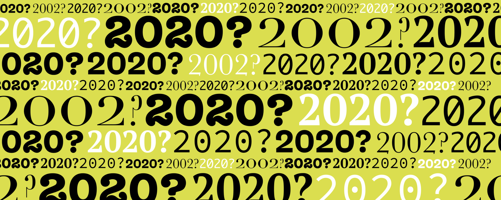
TYPOGRAPHY
There has been a shift of late away from the cold geometric sans-serifs of the last 5+ years. “Natural” and “warm” are two words that are being used a lot right now. This can be seen in the resurgence of quick serif faces that are appearing. Weird decorative typography is being seen in international publications as well as large-scale campaigns. There is quite a bit of talk around scripts being a way to differentiate in 2020. It also looks like sans-serif typography is being suggested for its clarity and directness, especially online. So, if you work with stripped-back sans-serif or serif faces, scripts or decorative type, your work will be on point.
IMAGERY
3D, super-maximalist images are raging right now. There are a lot of computer rendered illustrations that are being seen. A couple of designers here have read that authentic imagery is what is expected to be big over the next couple of years, as well as a movement back to raw sketch-style drawing. Flat is of course not going away. The trend of bold, simple colours, often with geometric conceptual icons, will always work on websites. There is also a feeling that we will see a lot of hyper-pastiche; the use of vintage imagery will always please. As well, more classic styles of illustration, painting and woodcut, are popular because they evoke hand-made traditions. We’re excited to see the authentic, 3D, flat, pastiche images that will be coming out soon.
LAYOUT
Intricate asymmetric layouts will lead this next while for graphic designers, with unconventional complex grids helping engage readers. We noticed a lot of dialogue around simplicity with things like web structures starting to influence print layouts. Classic book-style layout fundamentals are favoured right now with a lot of the forecasters we researched. There is new ultra-minimalism upon us where less information for users to read means quicker impact. Type-only layouts are really being celebrated by the magazine world, and we are also excited to see more illustrations appearing in publications. Photography – especially authentic, honest photos – have really caught our eye on Instagram too. Complexity and simplicity are at the forefront of design for 2020.
Hopefully, that clarifies everything?
As you can see, nobody knows. The only real trend that made any sense to us was ‘uncertainty.’ Trend forecasting has become quite humorous and is a great way to start 2020. With a bit of a smile.