2019 Design Roundtable
A Creative Director, Design Director and Senior Designer walk into a boardroom….
Design is what we do here at Hambly & Woolley, sure, but design is also something that we live. As professionals, I think that one of the fascinating things about designers, like anyone that embraces curiosity, is that we think about our work, its influences and our own inspirations all the time. So I thought that I would gather our Design Director, Frances Chen, Senior Designer, Heshaka Jayawardena, and myself into the boardroom and ask a few questions that reflect on moments from 2019.
What is the most memorable project we did in 2019?
Hesh: I immediately think of the report for ParticipACTION. It was a really intense project that had a lot of opportunities and challenges. We were asked to work with a campaign brand that worked well as a campaign but was harder to envision as a document. It came together well but there was a lot of pivoting that the document needed to do.
Frances: Mine is the Quadrangle Notebook
Dom: Really? Good choice. Why?
Frances: It has become such an interesting challenge. For nearly 10 years we have been asked to use their mark, the quadrangle, a square basically, but make it do something unique and surprising each year. I really loved the process this year. It was so much about attention to the small details that made it really exciting. I can’t wait for it to be delivered.
Dom: Well, mine has to be the Aecon website. I don’t think that I have worked on a project that had so much responsibility to its stakeholders, which came with an added level of pressure. This is one of those classic design projects where the ‘design phase’ was such a small part of the job. It was so much about making sure that each piece aligned with each department and fulfilled on very tight objectives. It was very macro-to-micro. Andrew and I really learned a lot of lessons from the process, but it was also great that Oscar joined us as we were working on the content population too. Quite honestly, Andrew and I would have beaten each other with sticks I am sure if Oscar’s calmness hadn’t been there…
What design project did you see that you wished you’d done in 2019?
Hesh: I have three that come to mind. The first was that Ural Music Night campaign. You remember the one with the torn paper? I loved that. The posters were so good. As for branding, I was really impressed by a mark for a furniture company called Resource. As a logo it was super simple. They made the upper-case R a chair. It is one of my favourite logos in a long time. Probably though my favourite overall branding project was Nicolette by Pentagram. It’s a major street in Minneapolis that was being reconstructed or something like that, and for the location brand they used a simple upper-case N, cut a strip down the middle, and it made two arrows. The arrows just indicate a two-way street but how they applied it to signage etc. was amazing.
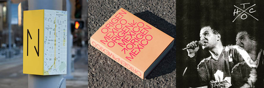
Frances: I have really been into book design recently. I am always inspired by books. The book that caught my eye though was done by Vanessa Eckstein at Blok.
Hesh: Oh is that the Mexico book?
Frances: Yeah, that one. I saw it on an Instagram feed for the publisher which I follow, and it immediately grabbed me. It is so nice. I would love to see it live. I think it is a personal project or at least a passion project. It was just a funny coincidence that it was Vanessa’s.
Dom: My two are books as well. The first is a book called notamuse. It is a collection of work by European Woman Designers and I was blown away as I turned each page. I know that we live in a time that you can find everyone on Pinterest, etc., but when someone curates a book as detailed as this it is a pleasure. The other one is the Tomorrow is too Late, the book Goods & Services designed to commemorate the Hardcore Punk scene in Toronto. It is so nice. Really clean. The typography is just a single face and weight. Pretty much all black & white. I am glad they got a Gold at the ADCC.
Typeface that you loved or hated of 2019?
Hesh: This face lands in between for me. OGG by Sharp Type is such a hard face for me because I do love the design, but it is EVERYWHERE. It is all over the place. So I really like it, but I would have a hard time using it.
Frances: I am in love with a face that Hesh introduced me to. It is called Archia from Atipo Foundry. Hesh showed it to me and I knew I had to use it in something.
Dom:
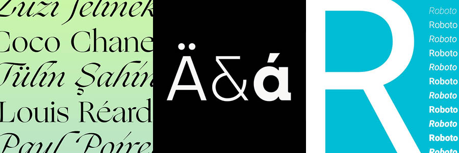
Mine is quite simple. I have just come to hate Roboto. It isn’t that it is a bad face at all. I have just become so lazy that I find I am using it too much and I need to stop.
What was the best piece of advice you gave our interns in 2019?
Hesh: Hmmm, I guess I don’t really talk to the interns. Ba ha ha… maybe some technical advice on something.
Dom: Nice. Feel free to pass on your wisdom next time. They were probably scared of you.
Frances: I guess the piece of advice I passed along was one that I have learned over my time working, and that is to not assume. Simple, don’t assume anything. Even if a question might seem obvious or dumb, it never is. It can make a huge difference and sometimes simply asking a question can get you out of a corner or save you a bunch of extra work. Just ask.
Dom: I say be flexible. One of the things I find with students is that they sometimes don’t explore as much as they should or even can. It is at this time in your life that you can try on many hats and see what works. That flexibility is for the projects that they do but I would also say that it’s a good philosophy in the beginning of your career anyway. You never know what opportunities will appear in this job market. I think a studio like ours used to be the normal route for a job, but really there are so many possibilities with agencies, in-house, start-ups, etc. that being flexible can leave you open to amazing things.
What will be the biggest design trend in 2020? (Ba ha ha…)
Dom: I knew you would both enjoy this. Crystal ball, please…
Frances: Well, my answer is probably going to sound a little idealistic, but I think a big trend of 2020 is going to be in finishing materials like paper. I think we are going to see a shift back to using really beautiful quality paper in projects. I know that it has shifted to the economy grades over many years but to really differentiate in 2020 I think designers are going to embrace craft again. As I say, it might seem idealistic but I really think that might happen.
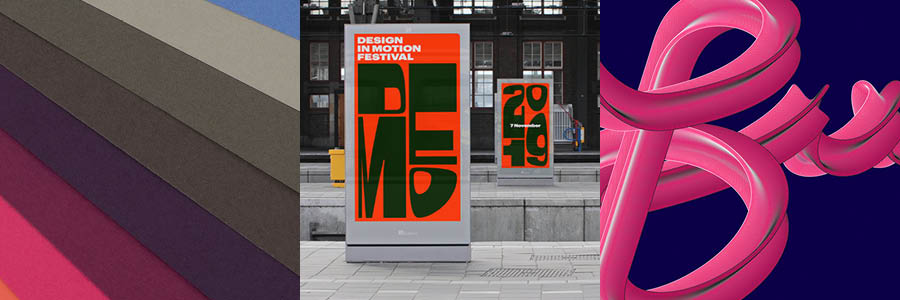
Hesh: I am hoping that there will be a bigger movement away from the antiseptic sans-serif wordmark trend of the last 5+ years, and that we will see more idiosyncratic typefaces being used in branding. We have sort of seen it with companies like Chobani or Mailchimp. They are using 70’s-inspired faces. Typefaces that have curves and details like Souvenir or Cooper Light, the face Mailchimp is using. It feels like we are over the non-personality sans-serif. It would be nice to see life and humanity come back to logos. I am also really interested, personally, in kinetic identities. Like the work that was done by Studio Dumbar on Demo Fest or some of the projects by DIA.tv. I am hoping to see more projects like these.
Dom: Sort of along the same lines as Hesh, I am hoping to see a real embracing of technology within typography and pushing of what can be done with the idea of opulence. You have really seen lately 3D styles and this movement toward things like chrome coming back into design. Take Jessica Walsh’s identity as a great example of that. Texture is back. I think this is a fun backlash to the flat pop colours and styles of identities like Dropbox and Spotify. I am also a big fan of the sneaking back in of post-modernism to design. Some would say it never left. I like the nonchalant mixing of styles sometimes appearing on the same page. Taylor made me laugh. He called it “design nihilism.” The rejecting of any prior beliefs and formalistic rules. Designers running amok make me happy.